Photo Projects At Home- Creative Shooting & Instagram Hacks
In this next instalment of ‘Photo Projects at Home’, we explore creative shooting, with a focus on different techniques on how to take better Instagram photos with both your phone or camera, and tips on how to present your profile. Instagram is one of the most popular social media sites at the moment and is used frequently by both individuals and businesses. If you are after more followers though, the quality of your content needs to be high and consistent. These are some techniques which will instantly make your photos better, regardless of whether you are using an SLR or your camera phone.
Light
Lighting is everything; it will make or break a photo. Bad lighting can make a photo look flat and boring, or alternatively it could be too much and very distracting. Firstly you need to work out where your light is coming from. The majority of people will use natural lighting and this can be easily utilised. Try to use directional light in your images; for example, placing your subject side on to a window in a darker room will create more dynamic lighting.
Also don’t be afraid to experiment with dappled light. Place patterned objects between the light source and your subject to create interesting looking shadows. A simple way to do this is by placing a colander or tea strainer near your subject and letting the light shine through it. You can also play around with artificial lighting too; if you don’t have an off-camera flash, you can use a torch as an alternative. (TIP: placing a thin, white, plastic bag over your torch will soften the light and create a soft box effect.)
Composition
Being more aware of your composition will drastically change your photos. Knowing where to place your subject in the image will make it a lot more creative and pleasing to look at. There are several compositional tools we can use while creating our images.
Rule of Thirds
A very common term in photography is the rule of thirds. I have demonstrated this on the photos below. It is about placing your subject in a particular place in the image to make it more pleasing to the eye. If you imagine your image is divided into nine equal parts, and then place your main subject along these lines or on their intersections. Placing your subject in this way creates more interest in the composition than just having the subject in the centre of the frame. (Not that there is anything wrong with symmetry as we will discover later). To help with this you can set up a grid function on your phone. For iPhones: [Settings > Photos and Camera > Grid On] For Android Phones: [Camera > Settings > Grid On].
Symmetry
Symmetry can be very effective if used well. It’s not just about having your subject in the centre of the frame, it’s also about framing elements around your subject too. For example, in the photos below I have used natural elements from the landscape around me to frame the photos. I have used the trees and branches to create symmetry, which draws your eye into the middle of the frame to the subject. It makes for an altogether more pleasing and interesting image. You can also use the grid function on your phone to help with this.
Golden Ratio
The Golden Ratio is a little more complicated, though it arguably creates the best results compositionally. The golden ratio is a natural and mathematical phenomenon, also known as divine proportion. You can read more in-depth about the Golden Ratio here. Simply put though, aligning your subject along these spiralling lines below will make a much more interesting image. The main subject or focus of your photo should lie in the middle of the spiral and the other elements in your photo ideally spiralling outwards. This can be achieved very simply as you can see in the right hand image; my model’s face is in the centre and her arm swings inwards creating a curve along her body. It’s very subtle but makes a huge difference. If her arm was just by her side it wouldn’t be nearly as good! It’s useful to have this in mind whilst editing and cropping your images too. If you aren’t totally happy with a photo, try cropping it to make it conform with any of these compositional principles.
Framing and Positioning
The next thing to consider when arranging your composition is where to position yourself in relation to the subject your photographing. Instead of just standing directly in front of the subject, think a bit more creatively.
You can use the elements around you to create a natural frame in the image, like shooting through leaves in the trees or shooting through windows and doorways. Also, instead of taking photos at eye level, change the angle at which your shooting from. Experiment with taking photos higher or lower to the ground. You could do a bird’s eye view or lie down and shoot directly upwards. You can also place the camera on surfaces or on the floor to makes things more interesting.
You can try different perspectives too by coming in very close to your subject, though beware of this if photographing people- the closer you are to someone the more the lens will distort their face, so it’s not always the most flattering! If you want a close up of a person, its better to take the photo at a normal distance, then crop in later if you can. Avoid using the zoom if you are using a phone as most phones use an electronic zoom so it will greatly decrease the quality.
Backgrounds
It’s not just your subject you need to consider, it’s the background too. In an ideal world, you want the background to be as uncluttered as possible to avoid distracting from your main subject. If your taking a photo inside, try to move any objects in the background. If your outside and you’re unable to move any background elements, then reposition your subject if possible to avoid anything distracting. Brightly coloured objects are the most distracting, regardless of whether they are untidy or not. For example, if I am photographing the inside of someone’s house, I will always move tea towels and washing up bottles as they are brightly coloured and would draw your eye immediately when looking at the photo.
In these images below I was taking photos for a jewellery maker to show off her latest designs. The left image is fine, but the amount of branches in the background, along with my hand, are very distracting. In the right image I repositioned myself to rid the image of these elements. Now your eye is drawn immediately to the product, plus the negative space around it makes for a better image.
Reflections
Using reflections where you can will add another dimension to your images. The most obvious would be mirrors, but there are many others to consider. You can use windows, or any other sort of reflective surface, or if it’s recently rained you can take photos of the reflections in the puddles. Using bright colours definitely works best in this scenario as it makes the reflection clearer and more obvious. You can play around with symmetry too or make a more abstract photo by photographing only the reflection.
Negative Space
Finding a white space to place your subject in front of will make the colours pop and draw immediate attention to the subject. You can also use negative space creatively with other different backgrounds. It is helpful to use the rule of thirds when doing this to achieve the best effect. Using negative space can also bring emotion into an image as you are essentially ‘isolating’ the subject, which in turn will make it more interesting for people to look at.
Monochrome
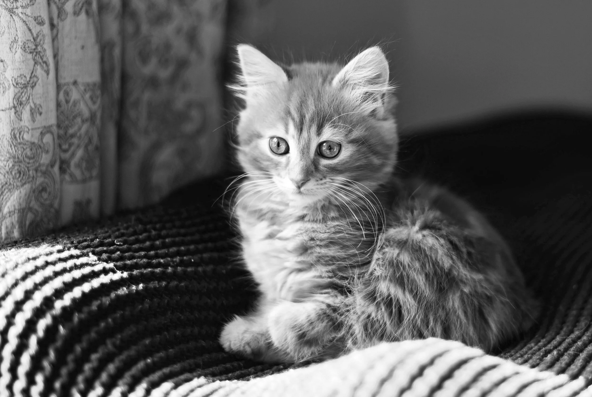
Another way to make your images more interesting is by using black and white instead of colour. Black and white images work best in situations where there is a strong natural contrast. For example in the images below, the dog is dark and lying against a bright floor with bright windows behind, therefore drawing your eye straight to the dog. In the image of the cat this is the opposite, where the background is dark and the cat is a lot brighter, again drawing your eye straight to the cat. Patterns come out really well in black and white as well. In the photo of the zebras for example, they stand out vividly against the background with their stripes. If this image was in colour you wouldn’t get the same effect. Using black and white will always help the viewer fixate on the main subject as there aren’t any colourful distracting elements in the background drawing focus away.
Extra Tips For Managing Your Profile
Alongside taking better images, there are also things you can do to your profile as a whole to keep followers, encourage new followers and to make it generally more appealing.
Consistency
Making your content consistent will attract more regular followers. You can do this in many ways. By deciding on the type of content you want to create early on, you will keep people coming back to your page. The majority of people follow pages on Instagram to see very specific content that they are interested in. In light of this, try to create content about something a bit more niche; if you are too generalised with your content you will lose certain followers as it will be likely that not everything you post will be appealing to all of them. You can make your content more aesthetically consistent too. You can do this by creating the same style of images, or you could use the same preset or filter on all of your images you post. You could even think about making them all black and white for example. It gives your profile a more polished, professional look and will make it a lot nicer to look at.
Alter Your Bio
There are ways you can adapt your bio to making it more interesting or professional. You can add breaklines, change the text alignment and add hashtags to your text by editing your bio using a laptop instead of your phone. For more detailed tutorials on this click here. Making these changes to your bio will make you stand out and will make the text more interesting.
Timing
If you post when your audience is more active then more people will see your images. You can check this easily by going to your Instagram profile, liking on the dropdown menu and selecting ‘Insights’. This will tell you when your audience is most active on your profile and therefore when you should post your photos. Just like blogging, posting consistently at scheduled times will keep an audience more captivated.
Hopefully these tips have been helpful to you and will enable you to create better photos generally, not just for your Instagram! If you are still struggling, research some of your favourite Instagram profiles and draw inspiration from the elements you like most. Have a lovely day and get photographing!
(All photos in this post are copyright of Aby-Joanne Photography).


